CMO Syndicate
CMO Syndicate approached Fathom Creative with an important task: their current brand wasn’t working and they needed a step up from the current brand. Under the art direction of Cameron Maher, I came up with the following visual identity, which they chose and are now implementing.
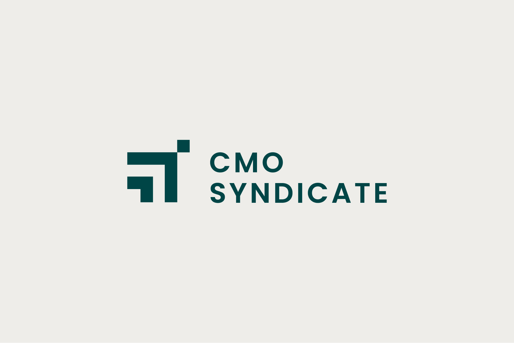
The logo mark incorporates a lot of symbolism for the brand. We wanted to emphasize that accelerated growth that is such an important aspect of the brand. The logo mark points onwards and upwards. We also have a small square that symbolizes the North Star, a guiding presence for clients, and also an aspiration to go big. To emphasize that aspect, we have two arrows going upwards, which can also stand as taking a client under your wing to get them to that goal. Lastly, we wanted to point out the pathways that are created within the logo mark.


